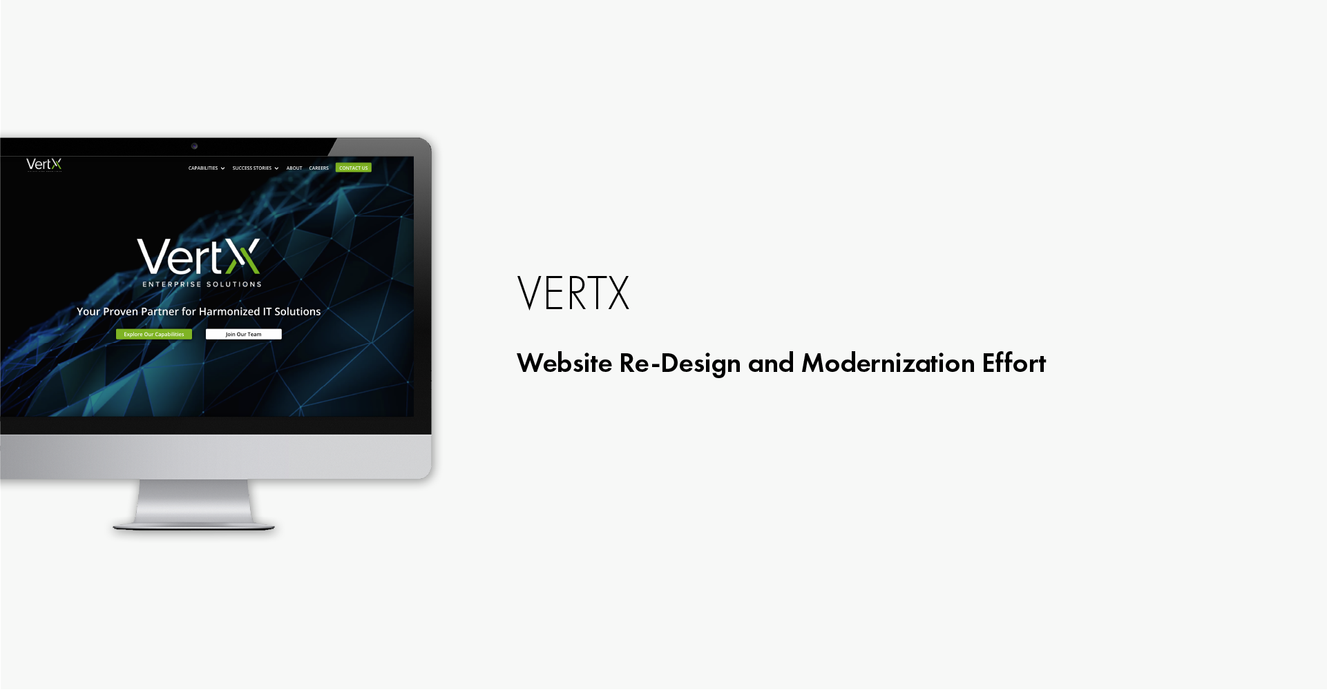
VertX Enterprise Solutions
VertX’s current website is clean, informative, and concise. However, it can be enhanced with a more detailed information structure and notable success stories, to differentiate VertX among its competitors
Challenge
Ignyte was asked to redesign the VertX website from a single page to a multi-page site. This includes an expansion of content, revamp of theming and visual style, and migration to a more modern technical framework – while enhancing the website’s user experience and business value.
Role: UX Researcher & UX Designer
Scope: ~ 3 months
Goals
Redefine information hierarchy and build additional detailed content
Revamp visual design to reflect contemporary design standards and highlight information
Refine technical architecture to enable ease-of-access for all consumers, on any device
Design Process
Here is the Ignyte six step design process that we utilized for this project and the deliverable(s) that were produced for each.
Research - Competitive analysis, User interviews
Define - User personas, Site map
Ideate - Low-fidelity wireframes
Build - Mid-fidelity wireframes
Iterate + User Testing - User testing, High-fidelity wireframes
Implement - Deployment
Competitive Analysis
We conducted a competitive analysis to gain a better understanding of Vertx’s current position in the market and how we can improve their visibility. We identified six competitors to learn about the content types and features that make a site stand out.
Based on our analysis, we’ve identified these key takeaways:
Highlight contracts and certifications
Provide examples of success stories
Connect the site to social media channels
User Interviews
Our team conducted 30 minute session interviews with 6 current users of the website that fall within our identified personas: employees, clients, and partners. We formed our interview protocol to include questions around what is currently working well for the site, expectations on features, expectations on informational blocks, and what makes VertX unique from its competitors.
The main themes we discovered:
Frustrations in lack of ability to find specific informational components
For each of the identified personas, based on their goals, they searched for different informational components that heavily influenced their perspective of the company. The lack of or inability to locate information negatively impacts that perception.
Difficulty in distinguishing VertX from competitors
The current one-page site is not effective in allowing users to quickly and easily identify VertX or how they compare to other competitors.
Users utilize the site to enhance their understanding of the company
Websites are used as a resource for users to become knowledgable about the company and as a decision point on how they would like to proceed with the company.
Personas
From our interviews and the key takeaways we discovered, we were able to clearly refine each personas’ goals and frustrations. The frustrations surrounding lack of information and distinguishing from competitors became the leading influence in our designs. And with all of our personas, we are able to safely design for users who are technologically familiar.


Site Map
Since our main objective is to take the current site and build it out from a single page to a multi-page site, we created a site map to help us accurately map out the hierarchy. This was a critical part of our process because these would be new flows for users.
Low/Mid-Fidelity Mockup
Based on our site map and personas, we started with a low-fidelity wireframe to begin our initial design process. We designed with keeping consistency across the site while utilizing new UI for the modernization of the site. Our low-fidelity mockups allowed us to quickly ideate through design trends that we found to fit VertX.
Brand Guidelines
Our team worked to revamp VertX existing brand guidelines to assist in visually distinguishing them from their competitors with consistent branding across. The updated guidelines assisted in cleaning up our high-fidelity mockups.
Positioning
In order to stand out against competitors such as Liberty IT, Arlluk, and InDev (among others), VertX must emphasize its three core brand values: Modern, Harmonized, Agile.
Modern – Up-to-date on the latest technologies and best practices. Not stale!
Harmonized – Holistic in approach, knowledge of downstream impacts. A real partner!
Agile – Focused on continuous improvement and achievable business value. Quick to adapt!
By understanding how VertX would like to position themselves, we are able to select images and provide images that are inline to emphasize their core values.
Mid-Fidelity Wireframes
From our initial low-fidelity, we began to add more branding and content to iterate through feedback from VertX and to begin preparing for usability testing.
Usability Testing
Before deep-diving into our high-fidelity wireframes, we conducted usability testing with the same users we had interviewed during our Research phase.
Research Goals:
All personas are able to easily navigate the new site
All personas are able to find content relevant to them
UI features are logical, allows users to stay engaged, and assist in navigation
From these testing, we were able to iterate through our mid-fidelity designs to ensure that user goals are being met and pain points have been addressed. For each persona, we assigned them tasks that were specific to their goals, in order to accurately gauge their workflows and to understand that they were able to find the relevant information they needed.
High-Fidelity Mockups
Once we finalized our designs from our usability testing and client feedback, we polished our designs and annotated them for development. I worked with the development team to ensure that UI designs and interactivity, along with branding were consistent throughout.


